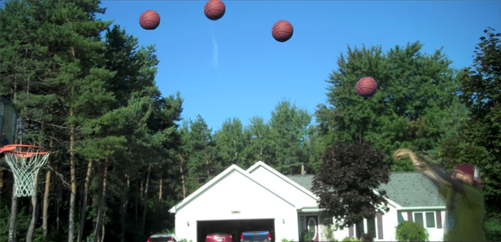
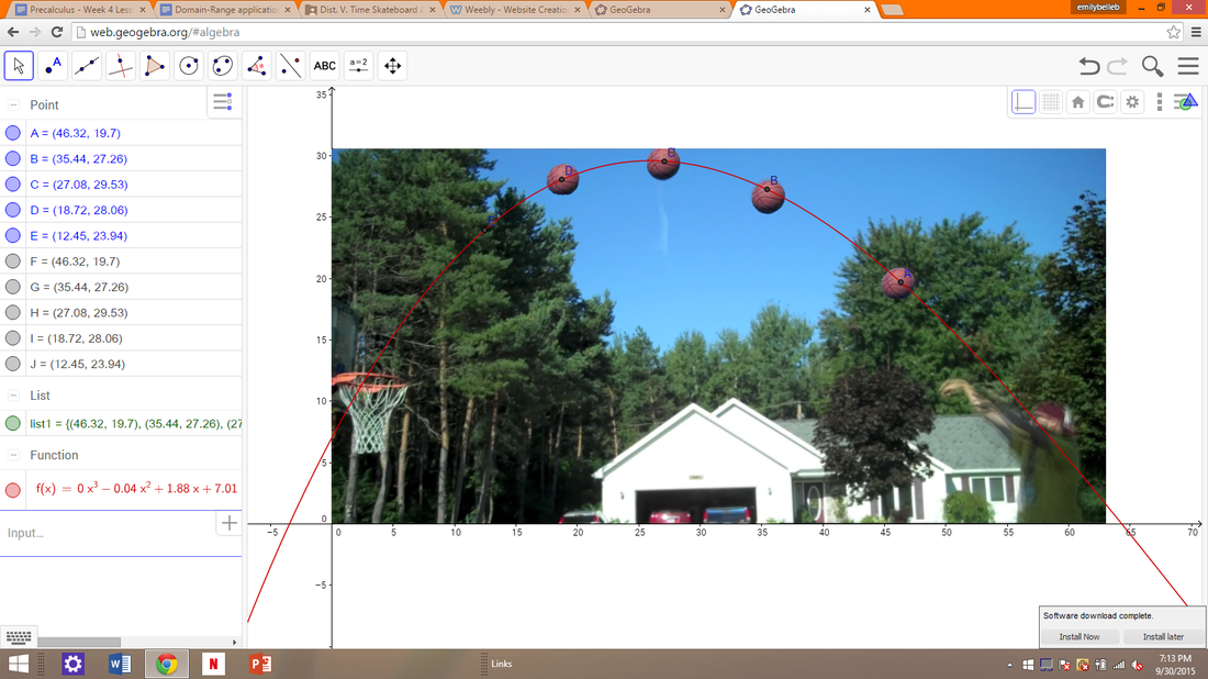
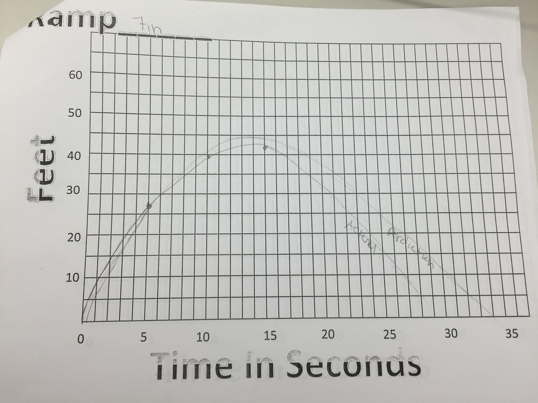
To make the mathematical model above, you first need to plot points. When did this, I chose to make five points and put four of them on each of the basketballs, that was I know the line that had to go through each of the points was accurately show if the ball was going to go in the hoop, I then added one other point that was not on one of the pictures of the basketball to show where the ball would of went when it was still continuing . Next, I typed my points into my spreadsheet, so I could then make a list of all my points. I then used the input space and typed in fitpoly, and added my list 1, as well as the highest degree of the polynomial, which was three. Finally, I hit add and the line of best fit showed up on my picture that I added to the graph earlier. And as you can see in the graph above, the basketball does make it into the hoop, making the ball will go in the hoop my prediction.
a. For the most part my predictions were kind of close. My first graph perdition was not very close in the beginning but towards the end it was very similar to the actual graph. For the 14 inch graph the prediction was also very similar, the only thing that is a little bit different was the peak of the graph was a few seconds before my perdition, other than that they were very similar. Finally, for the 7 inch graph my prediction was similar in feet and for the most part time, but at the end of the graph my perdition was over what the actual graph was. What lead me to make my perdition was I knew that the bigger ramps would have a further distance and longer time, so I would make my graphs taller and longer, and as the ramp got smaller I made the graphs have a shorter distance in a shorter amount of time.
b. The zeros of the graph represent the time in seconds of how long the skate board will travel for once it leaves the ramp. The larger ramps will result in the skateboard to travel for a longer amount of time then the ramps that are smaller. c. The skateboard at all three ramp heights all start out with the same zero, or zero seconds. But the bigger ramps will make the skateboard travel for a longer period of time then the ramps that are smaller, and you can see this happening in the graph. The maximum represents how far the skateboard traveled. The 21 inch ramp has the farthest distance since it was the largest ramp. The 14 inch had the next biggest and was second largest ramp. And the smallest ramp which was 7 inch had the shortest distance. The minimums of the graphs are also all different. The 21 inch ramp has the largest minimum, since the ramp is the largest out of the three. The skateboard on the medium sized ramp has the second largest minimum. And finally, when the skateboard was on the smallest ramp, which was 7 inches, the minimum was the smallest. d. When comparing the rise and run of all three of the graphs, each graph has a different slope. The graph that showed the skateboard going down the largest ramp, which was 21 inches, had a larger slope than the other two graphs. The 14 inch ramp, which was next largest in size, had the second biggest slope. And the smallest ramp that was 7 inches had the smallest slope out of the three. The reasoning behind this is because ramps that are larger will cause the skateboard to travel longer in distance and longer in time, making the graphs have a larger rise and longer run. Also, the larger ramps will cause the skateboard to go at a faster rate, which will make the graph to rise faster. The graphs that show the smaller ramps will also be falling faster since they went a shorter distance and the skateboard continued backwards. 1.This graph shows that the boy scout is raising the flag at a constant rate, meaning that for every second the flag is hoisted into the hair it increase the distance by the same amount.
The next graph shows that the flag was raised quickly at first but then slowly towards the end. Graph c shows that the flag is being pulled up but then stays at the same height for a few seconds. You can probably imagine that the boy scout is reaching up and pulling down and then reaching up with the other hand and pulling it down once again. Here the flag goes up slowly at first and then starts to speed up at the end. This graph shows the flag being hoisted up slowly up first, then gaining speed, and finally slowing down at the end again. The final graph shows the flag being nowhere, but then the flag is at every height at the same time, then it is nowhere once again. 2. In my opinion, the most realistic graph is graph c.I think this because the graph shows that every time the flag is being hoisted up there is a brief amount of time where the flag remains at a constant height. You can imagine that the boy scout is using both hands the pull the flag up, so every time the flag is hoisted up, the boy brings up his other hand to continue hoisting the flag. 3. The graph that is the least realistic is graph f. Graph f is least realistic because the flag begins at being nowhere, then it is at every height, and then nowhere at the end again. To make my art I used a variety of functions. To make the hair on my smiley face I used to different quadratic functions, then I had to flip the function to move it to the top of the head, and to do that I added a negative number in front of the x^2, then moved it up by adding a 4 to the end of the problem, to fit the hair around the face I made the number in front of the x^2 smaller than 1. To make the second piece of hair I did the exact same thing but used different numbers so it wouldn't be the exact same function. I then added a mustache to the graph, to do this I did a sine function to make line shorter I made the number out front a decimal and then subtracted 1 from the end to move the line down. Next I added a hat to my smiley face. To make the bottom of the hat I used a constant function and added 4 so it would sit at the top of the head. To make the sides of the hat I used two identity functions, to move the sides to match up the the end of the hat I put a positive 2 in front of the x on the left function and then a negative 2 on the right function, then for both I added a 15 on the end of the function. Finally I added two earrings on either side of the smiley face, I'm not sure what to call this type of function, but to move the earrings to the sides of the head I subtracted from the x to move it to the right and added to move it to the left, but I did nothing with the y to keep it on the x-axis. Also, for the hair and the hat I added something like this 1< X<1 to cut the line to a certain point so they ended and didn't continue on. The hardest part of doing this assignment was to figure out what to added to my smiley face, also it was hard to move the functions to where I needed them and I had to play around a lot just to get it in the correct spot.
|
AuthorWrite something about yourself. No need to be fancy, just an overview. Archives
November 2015
Categories |